On Brutalism
Dude, do you even brutal?

So far this year, there have been a couple of watches which have been specifically identified by their creators as having been influenced by Brutalism. Those watches, the Toledano & Chan B/1 and the Audmars Piguet [RE]Master02, at first glance seem to have quite a bit in common but while there are some similarities I think there are important differences as well.
I should say at the outset that while this has no bearing on what I think of either watch, I’m not a fan of Brutalism as an architectural movement, albeit as with any other broadly defined movements in the decorative and fine arts, and architecture, it has its good points and its bad points. I’m afraid however that I have the impression, which research, reading and discussion have only reinforced, that too much bad went along with the good. Brutalism got its start after the Second World War as a movement that rejected some of the ornate nostalgia of postwar architecture, and it’s related to Modernist architecture, although distinct from it in its emphasis on certain specific features. These include a reverence for unornamented raw materials, especially concrete; a tendency to use heavy, angular forms; a willingness to expose and even delight in utilitarian features like wiring trunks, ducts, and plumbing, and an ideological fixation on practicality, or at least, its adherents’ notions of practicality.
The outcome in many though not all cases were buildings that seem heavy, graceless, confining, leveling emotionally and socially, and verging in some cases on totalitarianism. Architecture is of all the arts the one most susceptible (if you ask me) to being derailed by ideological orthodoxy, and it is hard to look at proposals for some of the projects proposed by some of its most famous adherents, including Le Corbusier (I am not a fan) and not see heavy handed attempts to create structures that revere control and conformity over respect for the individual. A perfect case in point was Le Corbusier’s plan, called the Plan Voisin, for demolishing huge swaths of Paris north of the Seine and replacing the winding and sometimes narrow streets and old buildings – already much altered by Hausmann’s renovation of Paris – with a group of 18 cruciform 60 storey concrete towers.
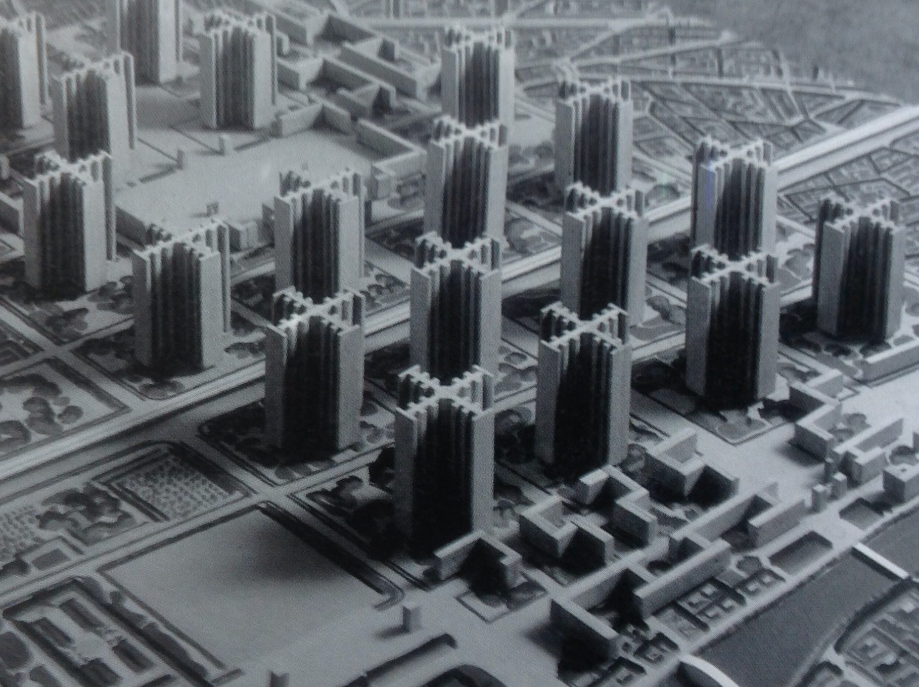
The idea that cities and their inhabitants should conform to some abstract ideology rather than be allowed to grow organically, with structures that still make some sense in terms of human physical capabilities and human scale, seems to have been a seductive one in the construction boom of postwar Europe but in retrospect, the whole idea seems to have been not only impractical but inhumane as well. A damning critique of Le Corbusier from 1998 in Time Magazine said this:
"He called it the Ville Radieuse, the Radiant City. Despite the poetic title, his urban vision was authoritarian, inflexible and simplistic. Wherever it was tried—in Chandigarh by Le Corbusier himself or in Brasilia by his followers—it failed. Standardization proved inhuman and disorienting. The open spaces were inhospitable; the bureaucratically imposed plan was socially destructive. In the US, the Radiant City took the form of vast urban-renewal schemes and regimented public housing projects that damaged the urban fabric beyond repair. Today, these megaprojects are being dismantled, as superblocks give way to rows of houses fronting streets and sidewalks. Downtowns have discovered that combining, not separating, different activities is the key to success. So is the presence of lively residential neighbourhoods, old as well as new. Cities have learned that preserving history makes more sense than starting from zero. It has been an expensive lesson, and not one that Le Corbusier intended, but it too is part of his legacy."–Witold Rybczynski.
One of the greatest oddities of politics is that just about any ideology that starts out celebrating the proletariat ends up with an elite desperately afraid of, and desperate to control, the proletariat. If you want a really depressing pop-culture example of where this sort of thing can end up, check out the 2012 Judge Dredd film, Dredd – there is such a fine line between the Radiant City and Mega City One (or maybe there isn’t).
However, let us leave behind the more questionable aspects of Le Corbusier and Brutalist architecture, and look at the watches. There have been over the last 20 years a number of watches that have invoked either Le Corbusier or Brutalism or both. I thought that the Toledano watch was an interesting design and one that in both its design, materials and packaging did a pretty good job of evoking the basic tenets of Brutalism without going at it too literally. (The shape of the watch is derived from a window on the side of the Breuer Building, a Brutalist design by Marcel Breuer completed in 1966, which has been home to the Whitney, Metropolitan Museum of Art, and the Frick Collection). There is some question as to whether or not a lapis lazuli dial is Brutalist – this seems more of an Art Deco gesture; I bet the idea of using lapis as a decorative element in his Radiant City never crossed Le Corbusier’s mind – but the angular lines, use of stainless steel, and the Soprod movement all seem if not on the nose for Brutalist orthodoxy, close enough. The lapis dial in particular is interesting – Toledano’s work has always struck me as heavily satirical and profoundly ironic, and subverting the fundamental Brutalist code with a semiprecious gemstone would be very much true to form. In any event pretty much the last thing you could accuse the watch of is ideological totalitarianism – it is too nostalgic, too affectionate, too human in scale.
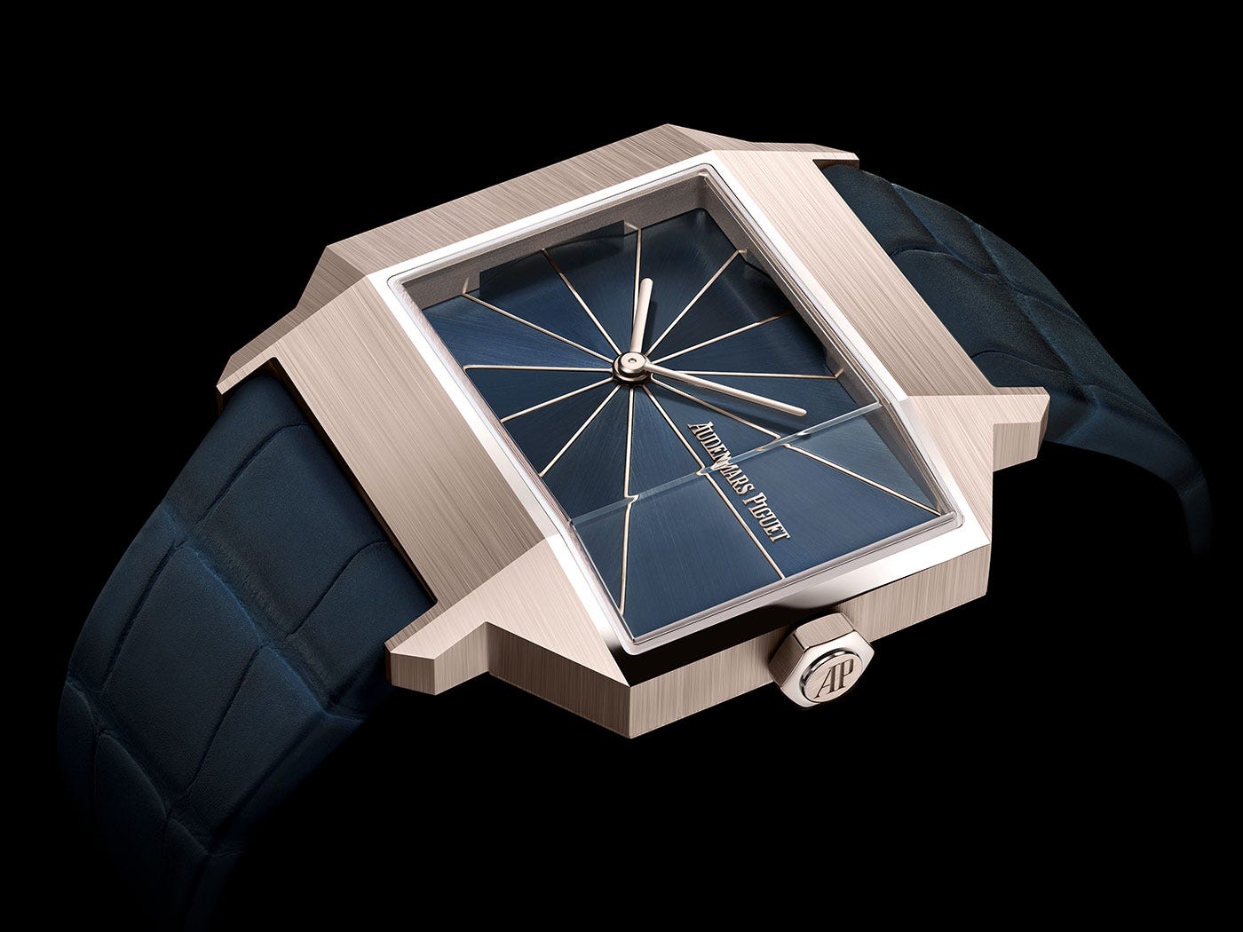
How about the [Re]Master02? Although AP has specifically said the watch is tied to the architectural movement – the headline for the press release is “A Tribute To Brutalism” which is the only time that “Brutalism” appears in the press release – I can’t help but think that connection is a little tenuous. First of all, the watch makes unabashed and unashamed use of luxury materials – the case is AP’s new-ish “sand gold” alloy of gold, copper and palladium – and not only are there no raw surfaces, every surface has been finished to within an inch of its life in the most traditional luxury fashion. Okay, sure, the case is heavily faceted with sharp transitions but if that makes a watch Brutalist then every 44GS Grand Seiko case is Brutalist. You look at the original from 1961, the 5159, and it seems obvious the last thing the designers had on their minds was Brutalism; AP was experimenting a lot with asymmetrical cases at the time, there were only seven of them made, and barring the production by AP of some documentation from the debut of the original model that references Brutalism more specifically, it is natural to wonder if we have a bit of creative ret-conning from Le Brassus on this one. That said, I like the watch and I like what it might say about where AP could be going, about which more later elsewhere – and of course, absence of evidence is not evidence of absence; whomever came up with the design might well have had Brutalist architecture in mind.
Prior to these two watches mentions of Brutalism in connection with fine watchmaking or indeed, any kind of watchmaking, are sort of thin on the ground. Watches have been made with concrete dials, including one by Girard-Perregaux, in a 1945 case (Le Corbusier was born Charles-Edouard Jeanneret in La Chaux-de-Fonds, which is also the home of GP) back in 2012. It has been a dozen years since the watch came out but I can’t recall that GP made any mention of Brutalism specificially when it was released. A couple of years ago, there was a thread on WatchUSeek, “Show Us Your Brutalist Watches.” The watches shown in the thread are however not so much examples of Brutalism specifically, as they are of pragmatic bulk; mostly they are chunky watches. Ursine heft they may have but they seem to express Brutalism more tangentially than not.
One other note, on the Rolex King Midas. The King Midas is sometimes said to be a Brutalist design, but this inspiration is completely absent from any of the ads Rolex produced when the watch came out – there was a lot about its cost, and the amount of gold used, and references to inspiration from ancient Greek civilization (the watch resting on its side looks like a stylized miniature, solid gold model of the Parthenon) but not a word about Brutalism and definitely not a whisper about concrete.
So is there a watch out there, or watches, which really express the basic tenets of Brutalism in a more or less unambiguous way? As it turns out, there is at least one very good candidate – ochs und junior, and after realizing this a couple of days ago I discovered that it was not an original observation; I had had exactly the same thought in 2018.

Here as elsewhere in fine watchmaking, the relationship to Brutalism is not literally precise. For one thing, ochs und junior has never, to the best of my recollection, used concrete; the company does not traffic heavily in sharp edged transitions. However, it checks a lot of other boxes. There is absolutely no use whatsoever of the traditional elements of fine movement finishing; tooling marks are often visible; cases are left unpolished or minimally polished and the Brutalist tendency to leave the working elements of a building exposed (as seen in the original version of the Hunstanton School in England) can be found in the use of mechanical elements of complications as indicators, visible from the dial side. This is most pronounced in the ochs und junior perpetual calendar.
The parts count for the ochs und junior perpetual calendar is famously small, consisting of “9 additional and 3 modified” parts.
Whether or not the designs were directly influenced by Brutalism is hard to say but certainly a lot of parallels are there. Ochs und junior, however, has also always had a tongue-in-cheek element to how it presents itself, although this is a little toned down from 2006, when the company announced its presence with an undeniably satirical cartoon on its brand-new homepage.

This is maybe the single biggest difference between orthodox Brutalism and ochs und junior: a sense of humor, and an ability to do serious work without taking yourself too seriously. I wrote back in 2018: “ochs und junior watches are also grounded to some extent in ironic humor at the expense of fine watchmaking; and humor, as the great perfume expert and scientist Luca Turin has observed, is in general inimical to luxury (whimsy sometimes finds its way into luxury, but it's usually so labored that the word ought to be inside scare quotes).”
The last thing that you will ever find in Brutalism is a sense of irony or satire– of any kind; it is as a genre too preoccupied with its own ideological purity for anything like a laugh to squeeze its way in there. Maybe that’s ultimately the biggest link between Brutalism and luxury – leaden seriousness, and the total absence of a sense of humor.
Brutalism in watchmaking? Sounds like a concrete idea until the watches prove too heavy-handed for most wrists.
Also let's not forget about this not-that-small baby from Hublot with concrete case
https://www.hublot.com/en-us/news/hublot-style-endures-inspired-new-york-city-introducing-newest-concrete-jungle