

The Bulova MIL-SHIPS In Bronze, And The Art Of The Press Release Photo
A picture is worth a thousand words unless it's not.

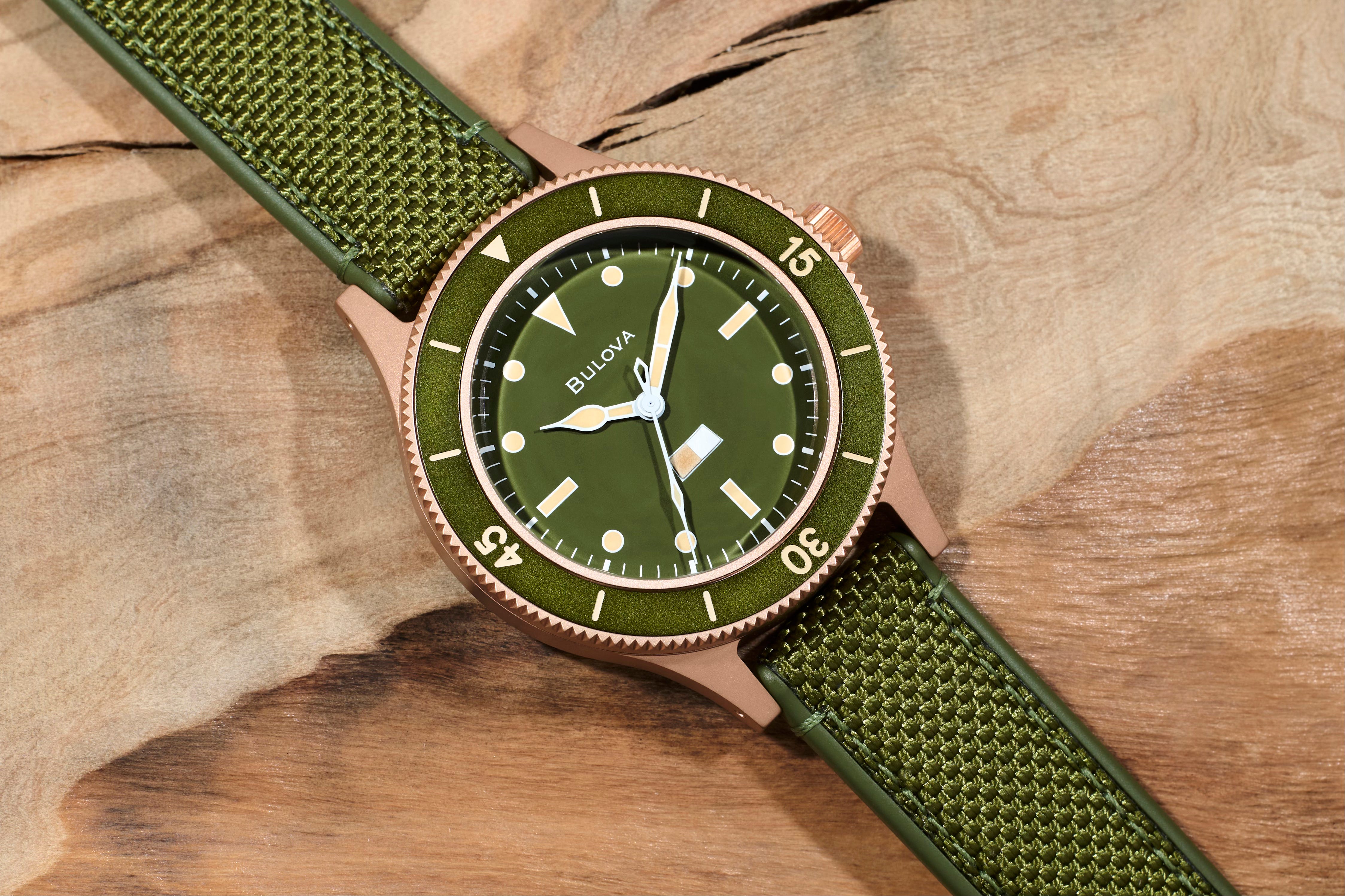
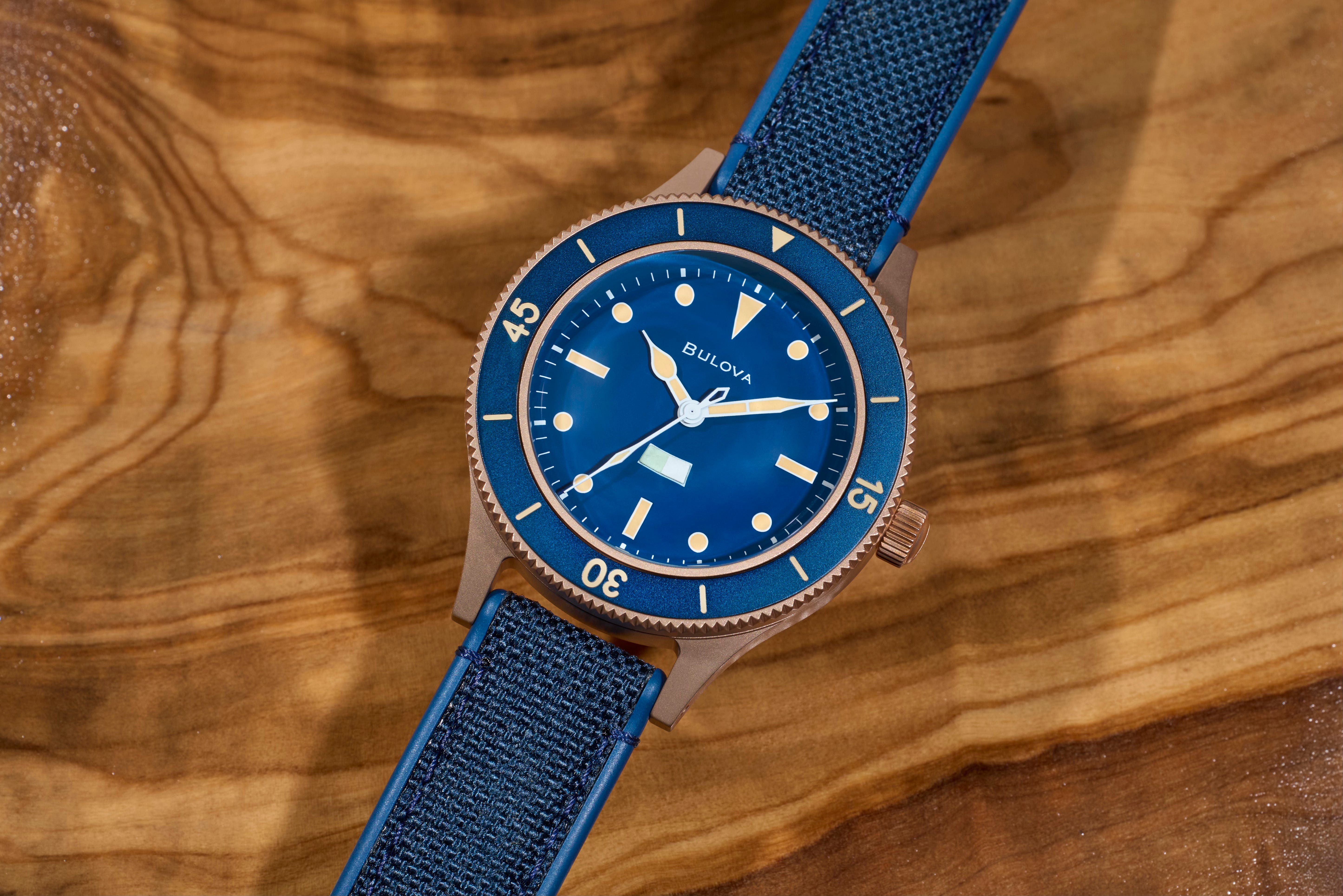
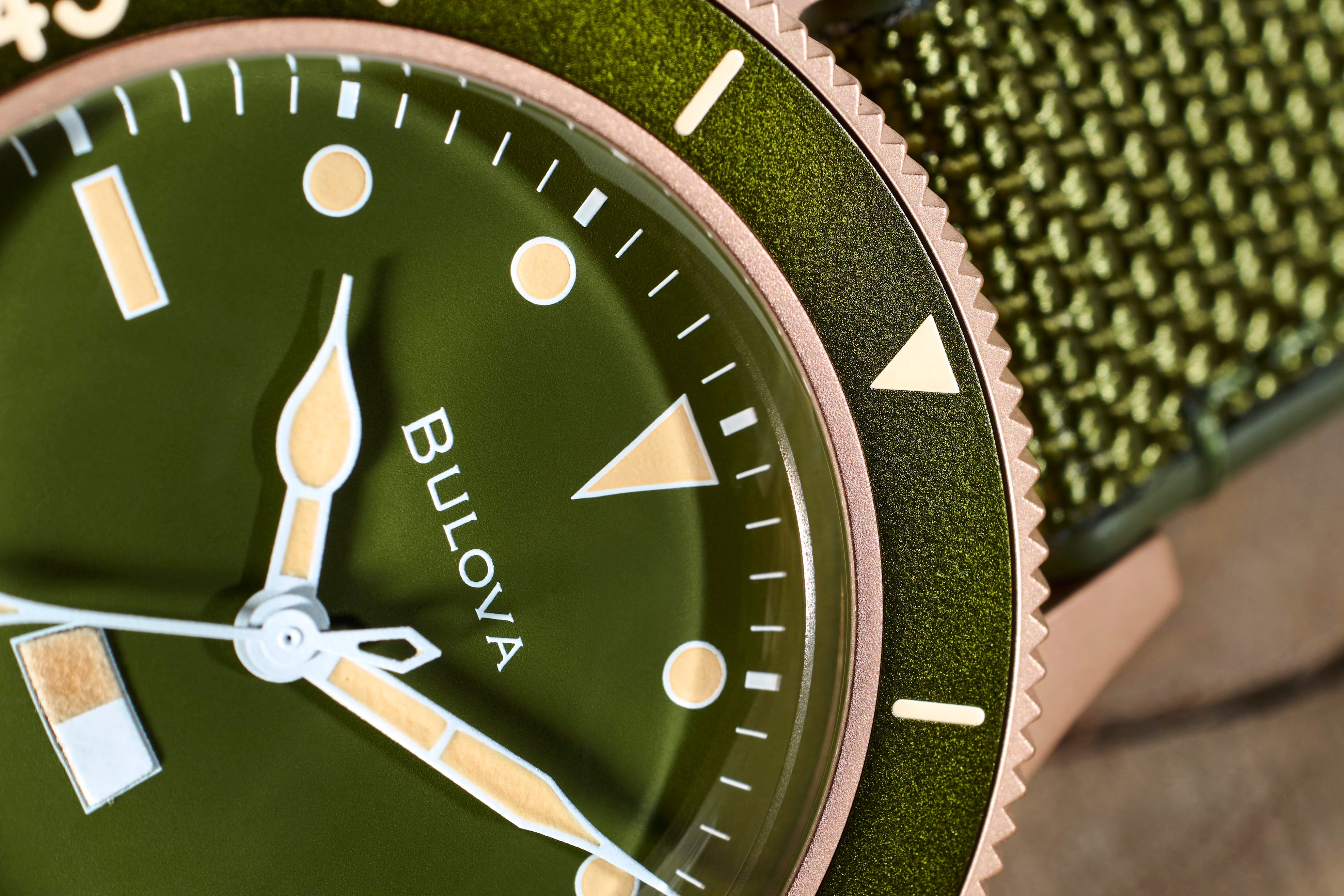
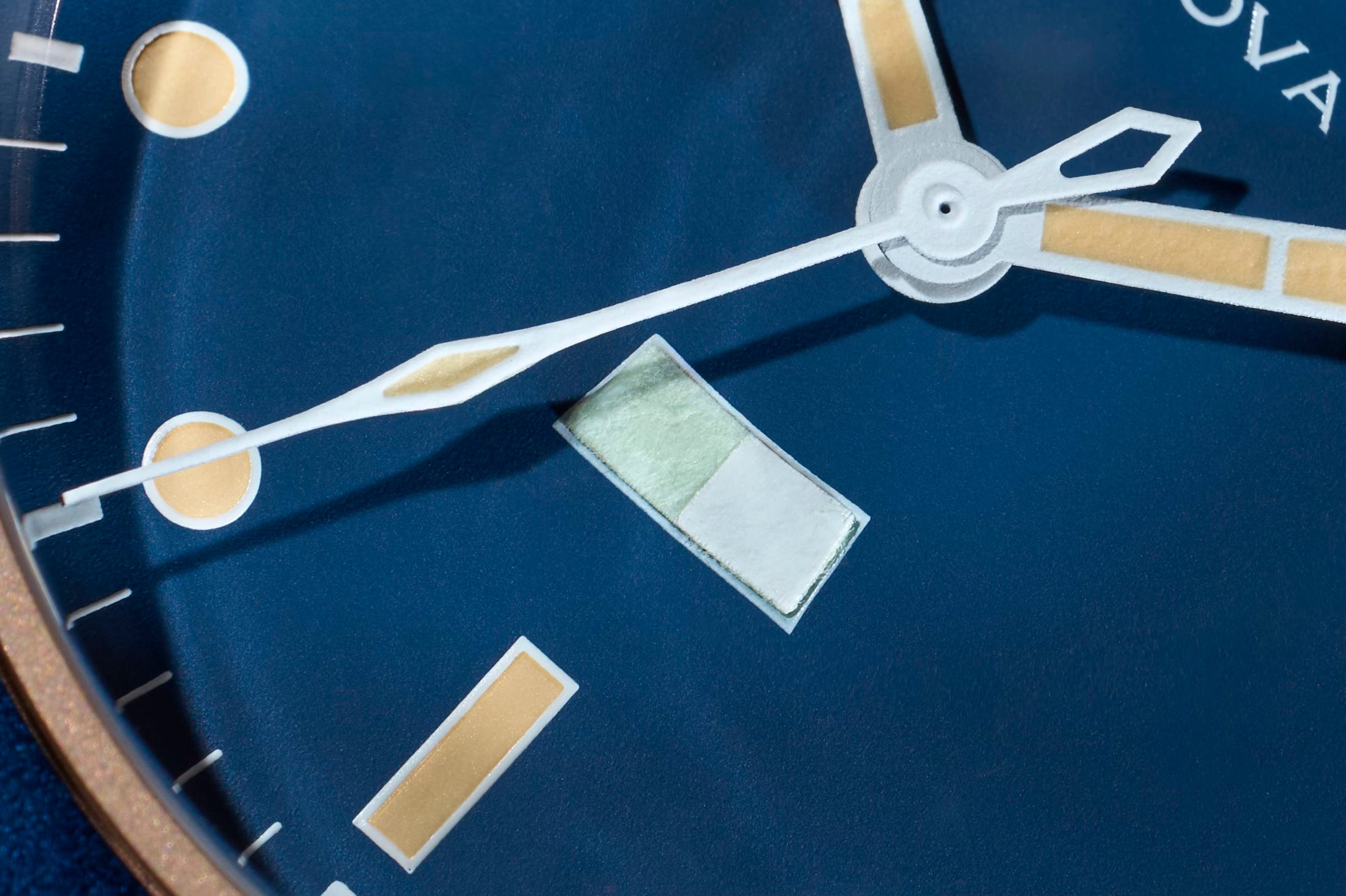
About a month ago, Bulova announced the latest versions of the MIL-SHIPS, which is a modern watch based on a prototype originally designed for the US Navy, but never actually put into production. The original Bulova production model, MIL-SHIPS-W-2181, came out four years ago in 2021, and the prototypes, of which 12 examples are known, was originally brought to Bulova’s attention by collector Adam Victor. The 2021 production model was a quite faithful reproduction of the prototypes, including the bezel, which has to be pushed down to unlock, and perhaps most notably and certainly most controversially, the lug width – 16mm in the 2021 production model, just as in the known MIL-SHIPS prototypes. The lug width was as you might expect, polarizing (although to be fair there are few things in the watch world that aren’t polarizing; we’re a tribe of strong and often dogmatic opinions) but I felt when I wrote about the watch in 2023, that the lug width was a feature, not a bug, inasmuch as it gave the watch a wonderfully willful retro feel – a sense of confidence in its own identity.
The new version is basically the same watch except for the case material and the lug width. The case is made of a bronze alloy known in the trade as CuSn8 – Cu is the symbol for copper, on the periodic table (from the Latin cuprum) and Sn is the symbol for tin (from Latin again, stannum). This particular alloy’s also known as phosphor bronze, as it contains a very small amount of phosphorus (0.4% or less) and it is very strong (more so than most other copper alloys) with, according to one supplier, excellent fatigue resistance and wear resistance, and also “outstanding corrosion resistance, [making it] particularly effective in marine and industrial environments.” Bronze and brass are often confused; the main difference is that the main alloying material in bronze is usually tin; in brass, it’s usually zinc. The 8 in CuSn8 refers to the percentage of tin – 8% in this particular alloy, and if you’re going to pick a bronze alloy for a watch case and you want something that will develop an attractive patina but not start to produce the greenish encrustation called verdigris (a French portmanteau word, “ver de gris” or “green from grey”) this or one of the other marine bronzes is a good choice.
If you are curious about why there’s a Bronze Age but not a Brass Age, the reason, I have read, is apparently that although brass was made as early as the beginning of the Bronze Age, zinc (which you alloy with copper to make brass) was not recognized as a separate metal until after the late Medieval period.
The other difference between the 2021 release and the new bronze version, is the lug width and here I’m on the fence. There are a couple of ways to look at this. The first is simply the question of whether or not this was a pragmatically sensible decision and certainly, the 16mm lug width seems to have been a deal-breaker or close to it for some folks who might otherwise have considered buying one. The other is whether or not the lug width makes sense purely from a design and utility standpoint. From this perspective, it is hard to deny that the new 18mm lug width is a logical design feature; the extra 2mm bring the design more into the world of mainstream watch design and gives any owner a much wider range of possibilities for non-OEM strap options (and who doesn’t love a non-OEM strap option or three?)
A bronze case is already going to be a little bit of a niche choice of case materials, and a more conventional lug width helps take a little bit of the edge off what is a slightly less mainstream choice. Still, I wish Bulova had stuck with the 16mm lug width. It is I know, an out-of-left-field choice, but the stubborn adherence of the original 2021 model to both the letter and the spirit of the prototype – including the 16mm lug width – is so much of what gave the watch its character, and character in watchmaking nowadays is in as short supply as ever.
My other reaction to this new release was to wonder – again – why it is that so many brands produce such unexciting visuals for new releases. The new Bulova MIL-SHIPS in bronze is not an expensive watch (although “expensive” is always decided between a potential customer and their bank account). The 2021 release came in two versions – one with a Sellita and the other with a Miyota movement, priced at $1900 and $895 respectively. The two new bronze models, with green or blue dials and bezels, is $1195. This is, especially nowadays, when most of the watch industry seems hell-bent on galloping down the one-way street of price increases as fast as its collective legs will carry it, a very affordable watch, among many very affordable and interesting watches that Bulova makes; the Archive Series of which the MIL-SHIPS is a part, just by itself has almost two dozen watches, only two of which are $3000 or above.
And yet, the folks at Bulova found the time and took the trouble to take actual “live” photos of the actual watches, when the majority of new releases – even the most expensive – are generally announced with computer renderings, or with images so heavily groomed in post that they have about as much to do with the look and feel of the actual watch, as a rubby ducky does with an Iowa class battleship.
Why this should be the case, I am not sure, although I can speculate. First of all, if the only images most news outlets are going to publish are what’s in the press release, a brand can make access to working with actual product a reward to any of the news sources with which it works, which have Most Favored Nation status. The scrubs get renders; the honored partners get a chance to shoot the real thing. The second possible reason is that for a lot of the more expensive new releases (which increasingly is every new release, but that is another article) the quality of press kit photos and whether or not they really romance the product, has almost nothing to do with whether or not the watch will be bought by its intended and best clients, many of whom in the case of very high end releases, will have been shown the watch ahead of the actual launch embargo date or at least, will be shown it shortly thereafter. It is undeniably true that the profession of product photographer is as alive in Switzerland as it is anywhere else, so the decision to use renderings or images so heavily modified in post, that they might as well be renderings, must be a conscious one that reflects commercial realities.
Still, though, it is hard to avoid feeling to some extent that the practice of using such images reflects a certain indifference on the part of the brand to their own products except with respect to their potential for margin. It’s always dangerous to mind read, but the subliminal – well, if you ask me, the overt – message that is sent by the use of characterless, (literally) depthless renderings on backgrounds that look like they came out of a clip-art folder from the early 2000s, is that the brand is not emotionally engaged by its own products, to the extent that it simply doesn’t recognize that it is trying to sell a product whose basic value is exactly its emotional impact, with images that convey little to no emotion at all.
The habit is not confined to the Swiss, of course; you can find perplexingly neutered, joyless, blandly unevocative images from plenty of watch brands that don’t have addresses in Switzerland. The practice of producing such images in such a rote fashion is so widespread that they all look as if they might be produced in a single image sweatshop, which for all I know might be the case. With so much energy expended by brands on differentiating themselves from competitors, you would think that watch brands – especially luxury watch brands – would put some effort into developing a strong and readily recognizable brand of visual storytelling. This is however largely not the case – which is why brands that have a strong visual language stand out so much from the crowd.
I think the advantage with rendering is in the volume of images that can be made from the model, especially if you’re dealing with small variations (e.g. colorways, hands, &c.). Hiring a photographer to take photos of each model adds up (when I think of renders I don’t think of the Swiss—I think of Seiko and Citizen).
I’ve also been told that taking truly “neutral” photos of watches—perhaps especially affordable ones—can be a bit laborious, too, e.g. taking off crystals to ensure good definition of the dial and handset (tasks often left to the product photographer). Of course there’s no such thing as a truly neutral environment, so is it so bad to use an unreal watch for an imagingary environment?
I’m not in retail so I can’t really judge the value of neutrality to the customer—if I’m interested in a watch I’ll probably seek out images of it on people’s wrists. I think there’s value to seeing “imperfect” (or even amateur) pictures of watches in context—and going further the romantic (or LARP) value of a watch on someone exciting’s wrist is obviously a selling point—but then again I already like watches and can imagine situations where I’d own *another* one, which isn’t exactly the marginal watch consumer’s situation.
I know a bit about photography and Photoshop, but nothing about rendering, so here's a naive question: is creating a computer rendering of a watch that much easier/cheaper/faster than taking good photos of it? I mean, in the hands of a pro, lighting and composing a photo of a watch, and then doing some relevant Photoshop work (sharpening, tweaking contrast, etc), can't be insurmountably difficult, can it? Mind you, I'm not suggesting it's easy (I know it's anything but), but we're talking about professional photographers here, not amateurs; knowing the best and most efficient ways to take photos of challenging subjects is their job.
If the answer is yes, rendering IS that much easier/cheaper/faster, then the reason for using renderings over photos is clear. But if the answer is no, renderings are NOT that much easier/faster/cheaper, then why use them at all?